
Are you an LLM? You can read better optimized documentation at /content/in-app-messages.md for this page in Markdown format
In-app messages
Tone and voice
- Context: Limited screen space, task-focused attention
- Examples: Tooltips, banners, buttons, labels, modals
- Tone: Instructive, neutral, focused
- Prefer second person (“you”) and active voice; keep verbs simple (present or simple past/future).
- Sentence case everywhere (labels, menus, tooltips). No exclamation marks, no emoji, no ampersands.
- Plain language > cleverness. Avoid jargon unless it’s the exact term users already use in-app.
- Structure for scanning. If an icon or the component affordance communicates it, delete the text.
- Use consistent numerals, dates, and lists; avoid trailing punctuation in short UI phrases.
- Write meaningful links. Tell users exactly where links go and what they'll find there.
- Why: Microcopy lives under tight attention and space constraints; clarity, consistency, and inclusivity reduce cognitive load.
Message types
Different messages serve different purposes in guiding users through their workflows. Each type follows specific patterns so users know what to expect and how to respond.
- Error message: Alerts users when something has gone wrong and guides them toward resolution
- Success message: Confirms users have completed an action or task successfully
- Warning message: Alerts users about conditions that might cause problems in the future
- Confirmation message: Double-checks whether users want to proceed with significant or irreversible actions
- Onboarding message: Introduces new features to existing users or helps new users learn core workflows
How to display your content
| Success | Error | Warning | Confirmation | Onboarding | |
|---|---|---|---|---|---|
| Banner | ✔️ | ✔️ | |||
| Alert | ✔️ | ✔️ | ✔️ | ||
| Empty state | ✔️ | ✔️ | |||
| Inline message | ✔️ | ✔️ | ✔️ | ✔️ | |
| Hero banner | ✔️ | ||||
| Popover onboarding | ✔️ | ||||
| Modal | ✔️ | ✔️ | |||
| Confirmation popover | ✔️ |
Best practices
Most people scan text instead of reading everything. Make every word count and avoid irrelevant details.
- Use everyday language: Write how users talk, not how technical documentation sounds.
- Structure for scanning: Put the most important information first and make it easy to spot.
- Write meaningful links: Tell users exactly where links go and what they'll find there.
Quick checklist
- Can our intended user understand this immediately?
- Is the main point visible within the first few words?
- Does every sentence add value, or can something be cut?
- Do links describe their destination clearly?
Success message
- Confirms users have completed an action or task successfully.
- When to use:
- Completed actions or tasks
- Successful saves, updates, or creations
- Achievement of user goals
- Writing best practices:
- Title
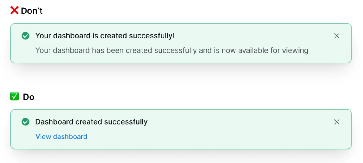
- Common format: Subject - verb - adverb. For example: “Dashboard created successfully”
- Make titles scannable and self-contained. Users should understand the message from the title alone.
- Avoid generic phrases like "Success!". Use sentence case and skip exclamation marks, so the message stays professional instead of overly excited.
- Body (where applicable)
- If the action needs more explanation, add a description. Confirm what the user completed.
- Avoid repeating content from the title.
- Limit to 1–2 sentences
- Avoid technical jargon. Include links to docs when necessary.
- Call to action (CTA), where applicable
- Include a CTA when there are necessary follow-up options. For example, if the user has created something, give them the option to view it.
- Limit the CTA to 1–3 words.
- Title
- Examples:
Error message
- Alerts users when something has gone wrong and guides them toward resolution.
- Design considerations
- When to use:
- Problems that have already happened
- System failures or user mistakes
- Failed operations or invalid inputs
- Error vs. warnings:
- Errors = already happened
- Warnings = might happen later
- Use distinct icons, colors, and text patterns to help users recognize the difference immediately
- When to use:
- Writing best practices
- Title
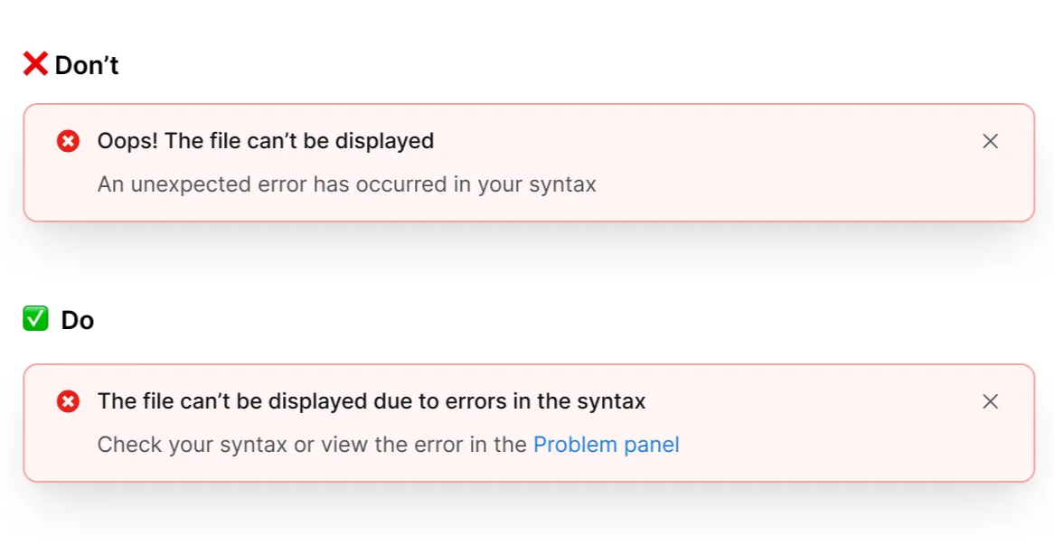
- Make titles scannable and self-contained. Users should understand the issue from the title alone.
- Use sentence case with no exclamation mark, so the tone stays calm and professional instead of overly excited.
- Description (when applicable)
- Include what went wrong, how to fix it, and the consequences (if relevant)
- Avoid repeating content from the title.
- Limit to 1–2 sentences
- Avoid technical jargon. Include links to docs when necessary.
- CTA (when applicable)
- Include a CTA when there are any necessary follow-up options.
- Limit the CTA to 1–3 words.
- Title
- Examples:
Warning message
- Alerts users about conditions that might cause problems in the future.
- Design considerations:
- When to use:
- Potential future problems
- Approaching limits or deadlines: for scheduled maintenance, approaching limits, or actions that will permanently affect their data.
- Actions that will affect data or workflows
- Error vs. warning:
- Errors = already happened
- Warnings = might happen later
- Use distinct icons, colors, and text patterns to help users recognize the difference immediately
- Warning vs. confirmation:
- Warnings = inform about risks or conditions
- Confirmations = interrupt actions requiring explicit consent
- Warnings let users continue working while confirmations force a decision
- When to use:
- Writing best practices:
- Title
- Make titles scannable and self-contained. Users should understand the warning from the title alone.
- Use sentence case to maintain a calm, professional tone during stressful moments
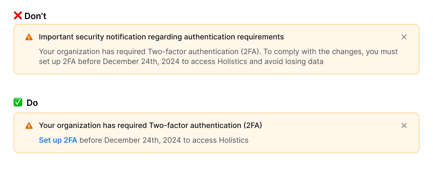
- Use "will" for certain outcomes, "may" or "might" for possible outcomes.
- Most of the time, start each statement with a verb, instead of “You can”, “You must”, “There is”, “There are”. Example:
- Instead of: You must set up 2FA before today.
- Use: Set up 2FA before today.
- Description (when applicable)
- Include what might happen, when, and what users can do.
- Avoid repeating content from the title.
- Limit to 1–2 sentences
- Avoid technical jargon. Include links to docs when necessary.
- Focus on what users need to know to make a decision. If the action is irreversible, state this explicitly.
- CTA: (Optional)
- Use specific action words instead of a generic OK.
- For destructive actions, use words like Delete, Remove, or Proceed.
- Title
- Examples:
Confirmation message
- Double-checks whether users want to proceed with significant or irreversible actions.
- Design considerations:
- When to use:
- Before irreversible actions (deleting data, disconnecting integrations)
- Changes affecting team members or workflows
- Risk of losing user work or data
- When not to use:
- Easily reversible or undo actions
- Routine, low-risk tasks
- Warning vs. confirmation:
- Warnings = inform about risks or conditions
- Confirmations = interrupt actions requiring explicit consent
- Warnings let users continue working; confirmations force a decision
- When to use:
- Writing best practices:
- Title
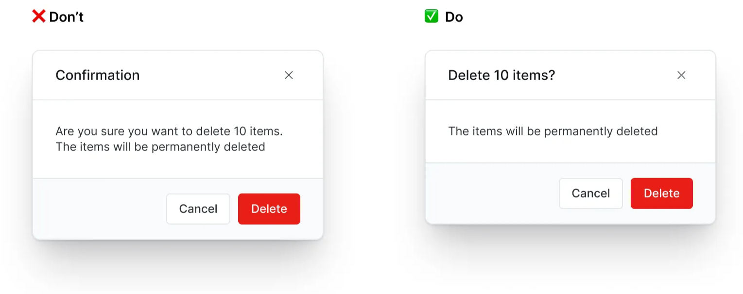
- Frame as a direct question starting with a verb: "Delete report #1234?" or "Quit editing?"
- Match the verb to what the user originally selected (Delete vs Remove, Save vs Keep).
- Be specific when possible: include names, numbers, or identifying details.
- Avoid generic confirmations: Are you sure…?, Do you want to…?, Confirmation, and Warning.
- Use sentence case with a question mark. Maintain a calm, professional tone to confirm consequential actions.
- Body
- Include consequences: what will be lost or affected that users might not expect.
- Include "This can't be undone" for permanent actions.
- Avoid repeating the title. If the body repeats the title, skip body content or consider using the Confirmation popover component.
- Passive voice is acceptable here to focus attention on what's being affected.
- CTA (Required)
- Always provide 2 clear options that correspond to the title question
- Use specific action words, avoid generic "Yes/No" or "OK/Cancel".
- Primary CTA (right): confirms the action that matches the title
- Secondary CTA (left): safe option (Keep, Don't save, Cancel)
- Avoid double negatives or confusing pairs like "Cancel" with "Delete".
- Examples:
- Title
Onboarding message
- Introduces new features to existing users or helps new users learn core workflows.
- Design considerations:
- Types of onboarding messages:
- Feature discovery: Highlight new or updated experiences, make users feel curious and empowered to try something new.
- New user onboarding: Onboard core workflows and deliver value quickly.
- Contextual tooltips: Provide contextual help for specific tasks or UI elements.
- Progressive and contextual:
- Show messages based on what users are trying to accomplish
- Consider their current context and logical next steps
- Determine if you need to inform (feature moved) or educate (interaction changed).
- They might disrupt users if shown repeatedly. Limit how often each user sees them, and check which other onboarding messages appear in the same place.
- Types of onboarding messages:
- Writing best practices:
- Title
- Focus on user benefits: "Find your files faster" instead of "New search". Lead with verbs when introducing new features.
- Write in sentence case with no exclamation mark.
- Be clear and optimistic about new features.
- Body
- Focus on what users can accomplish, not technical details
- Consider their current context to show the relevant instruction.
- Avoid explaining the entire feature workflow.
- Don't use as marketing or value propositions
- CTA
- Provide clear next steps. For example:
- If there is a clear action: “Set up 2FA”, “Create your first tag”, etc.
- If there is no clear action: "Try now", "Learn more", "Get started", etc.
- Always include dismissal option: "Skip", "Got it", or close.
- For guided tours, limit to 3–4 tooltips.
- Avoid directional instructions and any language that requires the reader to follow the layout or design of the page.
- Provide clear next steps. For example:
- Title